Many would agree that an outstanding user experience attracts visitors and improves the effectiveness of any e-commerce website. In this article, you will find everything you need to know on how to increase your online store conversion.
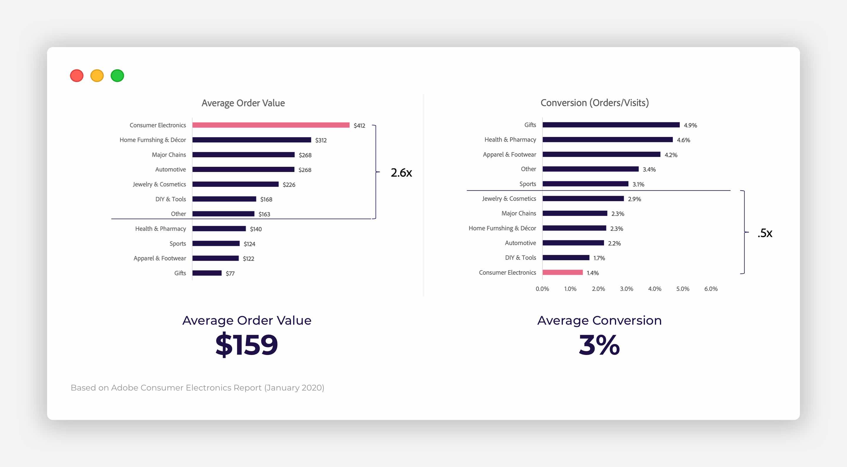
To begin with, let’s look at the average e-commerce conversion rates in 2020. According to the Adobe Consumer Electronics Report 2020, the average conversion rate among various industries is about 3.0%. Based on this report, the highest conversion rates have been achieved in cases where consumers are looking for something with the intent to buy that item or service, for example, Gifts, Health and Pharmacy, and Apparel and Footwear.
In regards to Shopify stores, the benchmark e-commerce conversion rate is around 1.75%, with larger stores having about 1.85%. Shopify stores in the top quartile achieve conversion rates of over 2.8%, with the highest rate at 8%.
Therefore, if you are not satisfied with the current conversion rate of your e-commerce site, the tips below can help you detect areas for improvements to increase conversion.
Feel free to navigate to any item in the list by hitting their respective links below:
- What are the best colours for conversion?
- How many products to display to increase conversion?
- Understanding customers’ needs to optimise conversion
- Considered vs Impulse purchases
- Resources and Appreciations
- Frequently Asked Questions
What are the best colours for conversion?
When you have an established brand, there is not much freedom for choice as you have to stick to the colour palette that has already been determined. Nevertheless, when it comes to improving the conversion of your online store, you might need to deviate from your existing colours.
The question is what colour converts best? Unfortunately, no one solution fits all, and the answer always comes down to A/B testing.
This is all about finding the balance between what fits with your brand and what gives high conversion rates. Moreover, until you have a 100% click-through rate, there will always be A/B testing to run.
Please take into account that, when you make any changes to your existing website, you should only make one change at a time so that you will see exactly what works and what doesn’t.
How many products to display to increase conversion?
You may wonder how many products you should display per page to increase conversion for your online store. It can be tempting to display all your products on a page and expect your customers to be attracted to the many options they see. If this were the case, most e-commerce stores would have no problems with conversion.
Although having lots of choices might appear desirable, research has shown that customers become disoriented and unmotivated when there are too many choices available. This became apparent when the inclination to make a purchase was compared between a 24-flavour and 6-flavour display of jam.
According to this study, when consumers saw 24 different flavours of jam, on average, 1.5 flavours were sampled. On the other hand, at the 6-flavour display, an average of 1.38 flavours was tested.
In both cases, customers sampled no more than two different flavours.
Furthermore, nearly 30% of the consumers with fewer choices subsequently made a purchase, while in comparison, at the 24-flavour display, only 3% of the consumers purchased jam.
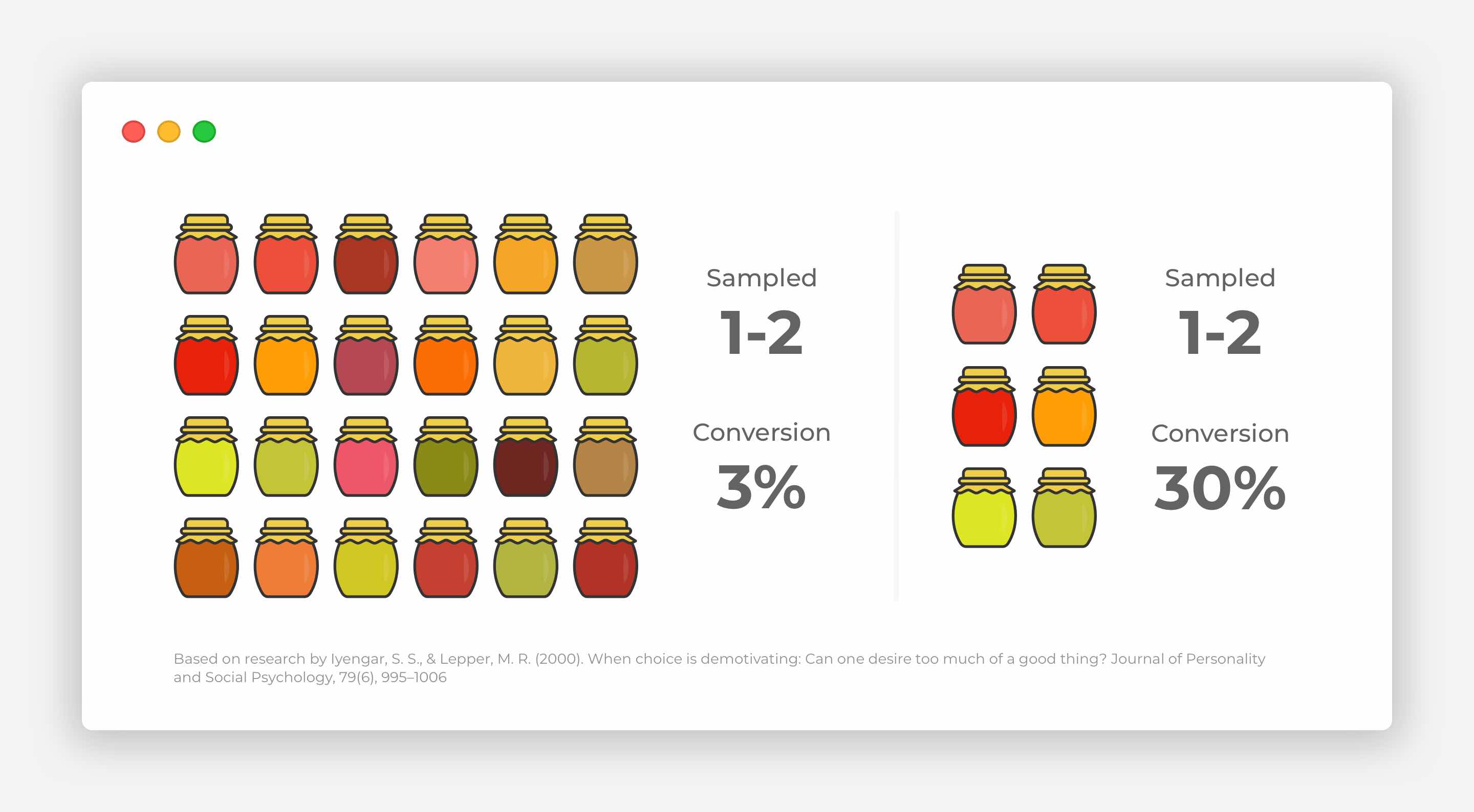
This makes it clear that abundance can create, what is called, choice paralysis, meaning that customers may struggle to make a decision, which can, in some cases, lead to dissatisfaction when a decision is made, as the customer starts thinking about the missed choices.
Therefore, you need to keep it simple when designing layouts for your online store. If you want to increase conversion, start to offer fewer products per page, helping your customers avoid an unpleasant experience, and boosting your sales.
Also, make sure that you have a reduced amount of calls to action or fewer options and places your users need to click. This will avoid confusion and help drive sales. Make it clear for your visitors on what to do, so it will be easier for them to choose and buy your product.
Simply put, less choice equals more sales.
Understanding customers’ needs to optimise conversion
The most crucial aspect of user experience is to understand what your customers want.
Research helps you learn more about your customers’ needs and behaviour.
Usually, this can be done by way of speaking with a few of your customers (I’d say up to ten people) and watching how they interact with your online store as well as with some of your competitors’ stores. This can give you valuable insights and help understand the importance of particular product page elements to improve them for your customers’ use.
In addition, I would suggest paying more attention to the product page. This is the section of your e-commerce site that is most critical for conversion and to sell your product or service. It is vital to understand and meet your customers' needs to make a product page that converts. This makes the intuitive user experience extremely important.
Here are the elements that would be relevant to any product pages and which you might want to check and improve on your online store:
- Product Image
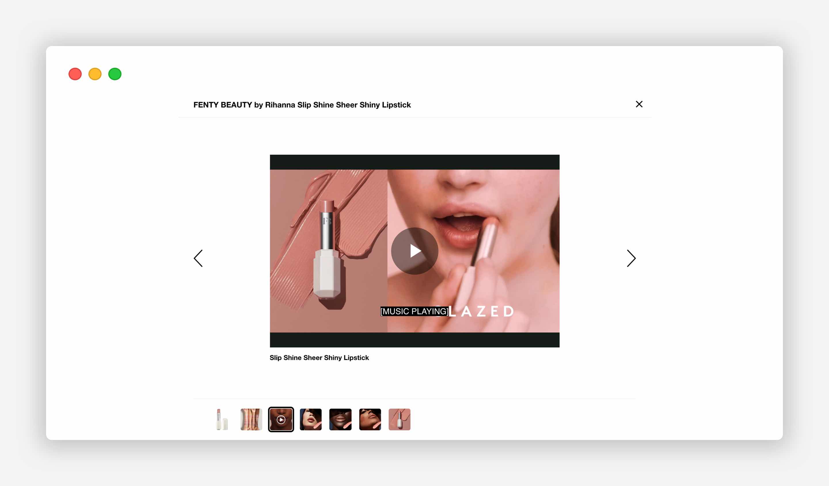
- Additional Product Images and Video
- Product Title
- Add to Cart Button
- Price
- Product Description
- Delivery Options
- Product Reviews
- Detailed Product Specification
- Returns and Refunds
It would be useful to list and rank these elements in order of their importance to help meet your users’ needs and make the design much more intuitive and streamlined. When you go through your ranking exercise, place those options in the hierarchy that matches your users’ needs, rather than considering your own choice.
Also, if you sell several different types of products, you might want to consider optimising the user experience of every distinctive type of product you sell.
Designing a product page using this approach will not only help streamline your design process but will eventually improve the overall user experience within your e-commerce store.
Now, let’s discuss every element of the product page in detail, to boost conversion of your e-commerce store.
Product Image
One look is worth a thousand words.
-Frederick R. Barnard
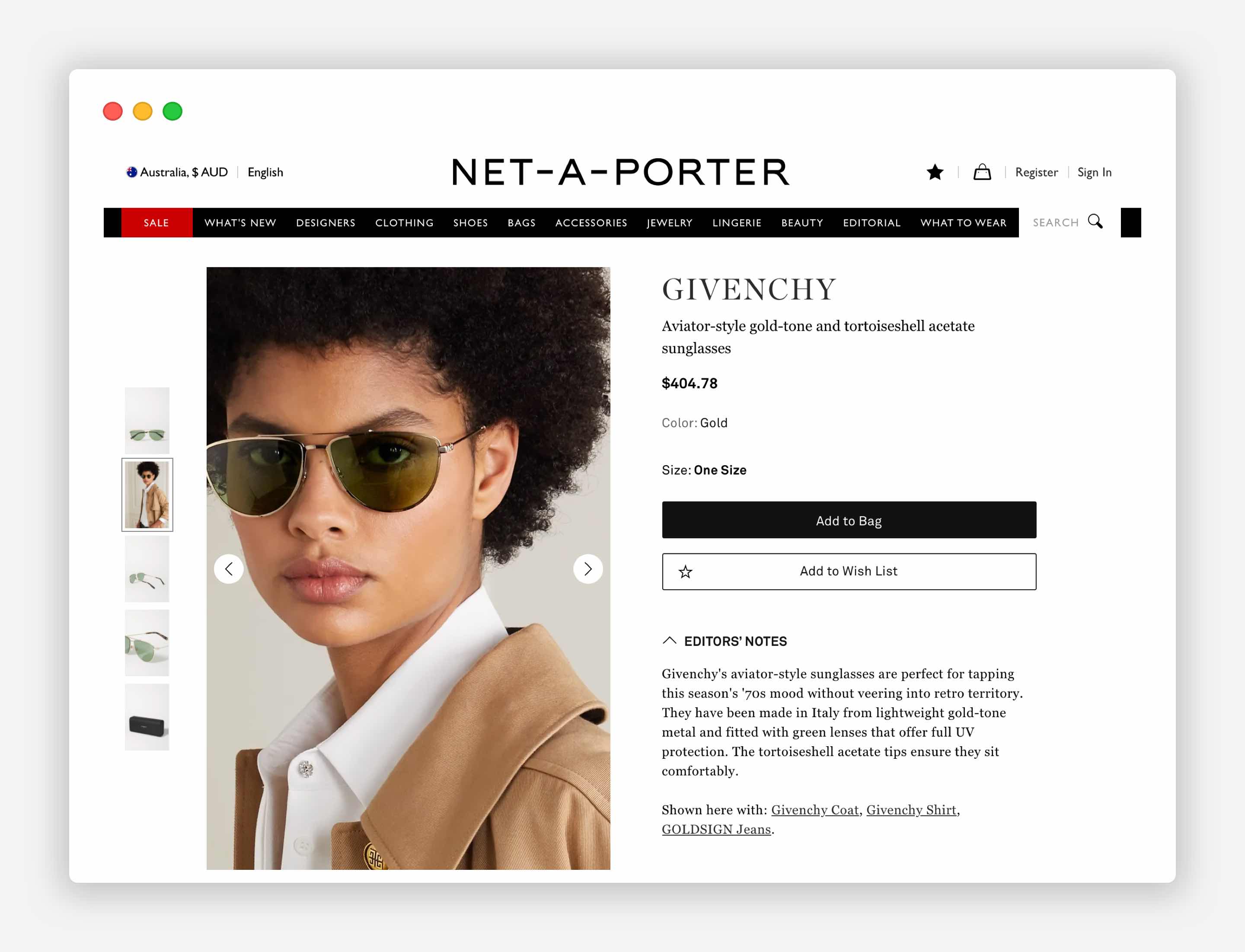
The product image is an essential element of the page. It does all the hard work for you, as it sells the item. A product image helps visitors get excited about your product. That’s why those product images that convey how the product makes your customers feel, and how it can make their lives better, will always convert visitors into customers.
67% of online shoppers believe that images are vital when making a purchasing decision, with 63% of consumers saying that good images are more important than product descriptions.
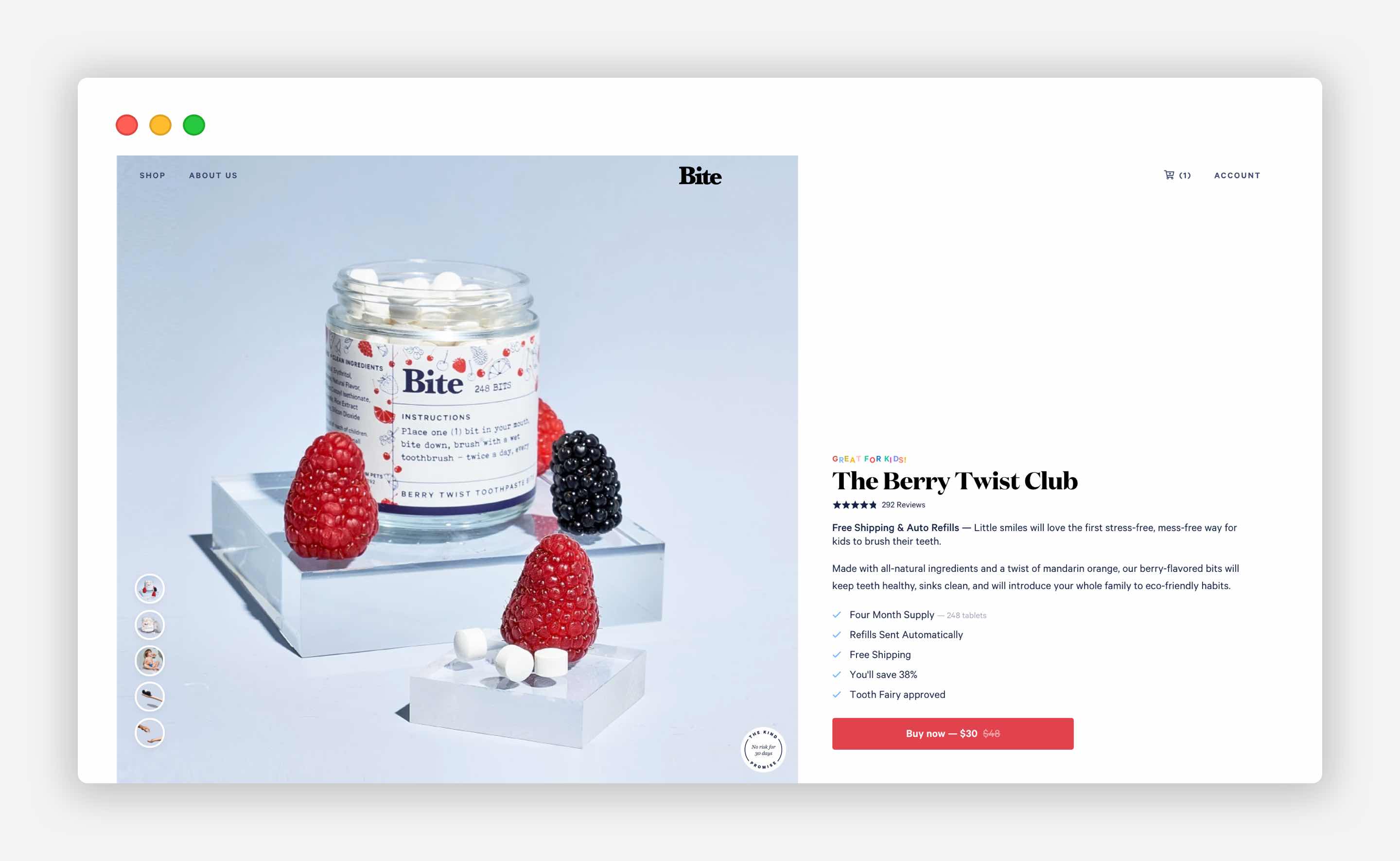
Your product image needs to address the emotional feel and the rational utility of your product, in order to convert. Thus, let your customers zoom in on specific details of your product, watch a video, and imagine themselves with the product as they look at their screen.
Want your image to be compelling? Make it big and high quality, unique and stand out from your competitors. This is especially important for stores that sell products where consumers can be concerned with every little detail.
Additional Product Images and Video
The rule here is the more product images you have on your product page, the better.
It is essential to show all sides of the product by taking practical shots that showcase all the details and features.
Don’t forget to appeal to both the emotional and rational decision-making of your visitors. Let your additional product images and video content get the hard work done and sell your product.
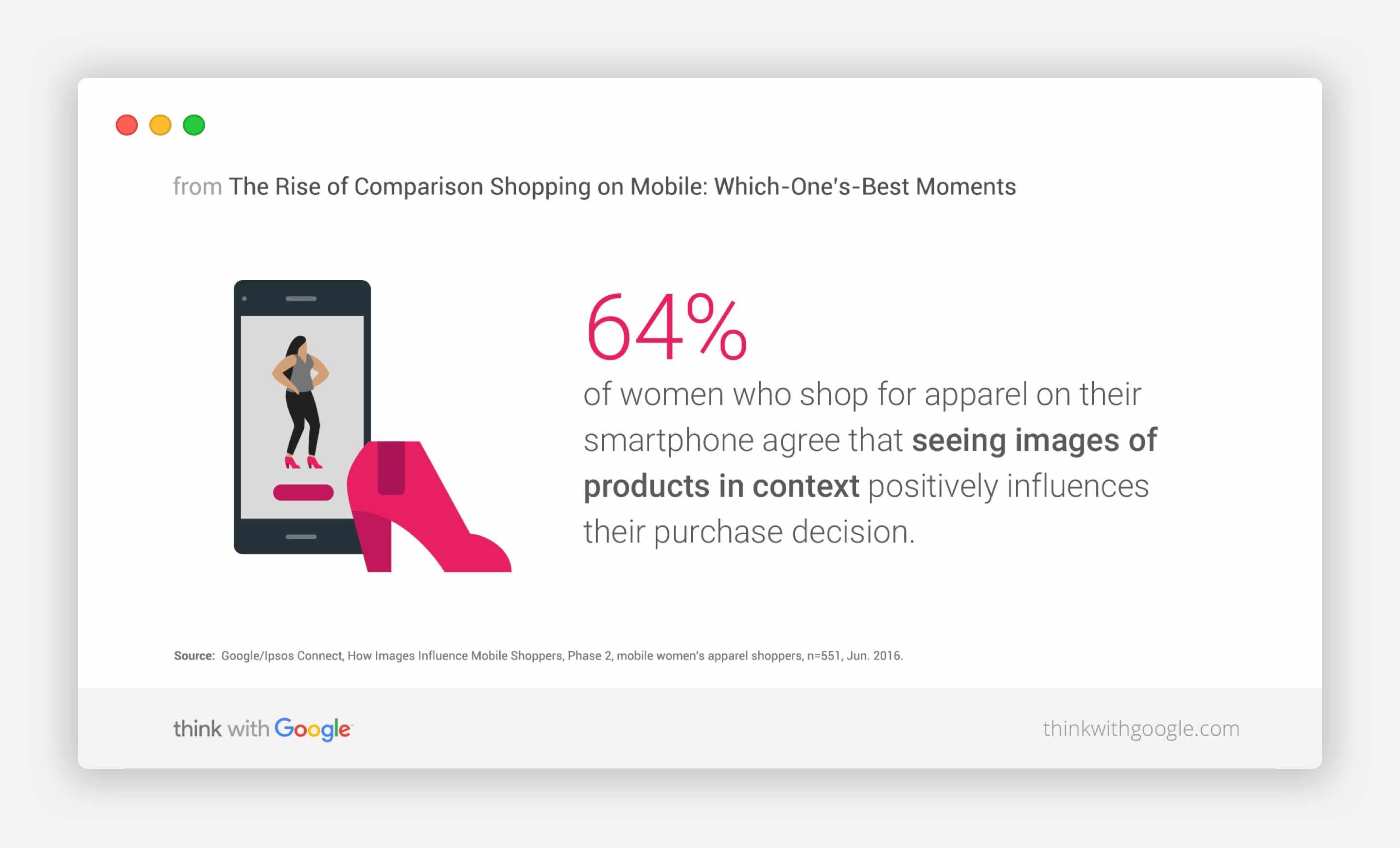
Moreover, feature products in context. According to Google, 64% of women who shop for apparel on their smartphones say that images of products in context positively influence their purchase decision.
Also, 90% of online shoppers find videos helpful in making decisions about purchasing a product. Moreover, online shoppers who view video are 1.81X more likely to purchase than non-viewers.
Get the best results out of the gallery photos of your product by using images associated with the product details that you highlighted in the product description - for example, the comfort, quality and feature elements.
Don’t forget to label every image with a relevant description to highlight, one more time, the quality of your product, as well as the Alt text that is essential for SEO purposes.
Product Title
Let it be unique and in a bold and easy-to-read typeface. You can hit your visitors’ emotional buttons by merely adding in a concise description of the product within its title, as long as it is not more than 60-70 characters long.
This trick can also work for SEO purposes and boost your credibility when users start shopping around and googling the product name to compare the prices with competitors. If they are searching using your unique product name, you should appear first in the search results, which gives you more discoverability and credibility with users, even if your product is not the cheapest option.
According to Search Engine Watch report and a research study by Optify, the top-ranked websites on Google receive the following average click-through rates (CTR):
- #1: CTR = 36.4%;
- #2: CTR = 12.5%
- #3: CTR = 9.5%.
According to Gabe Donnini, the share of impressions coming from the first position on Google is double the performance of the second position.
Add to Cart Button
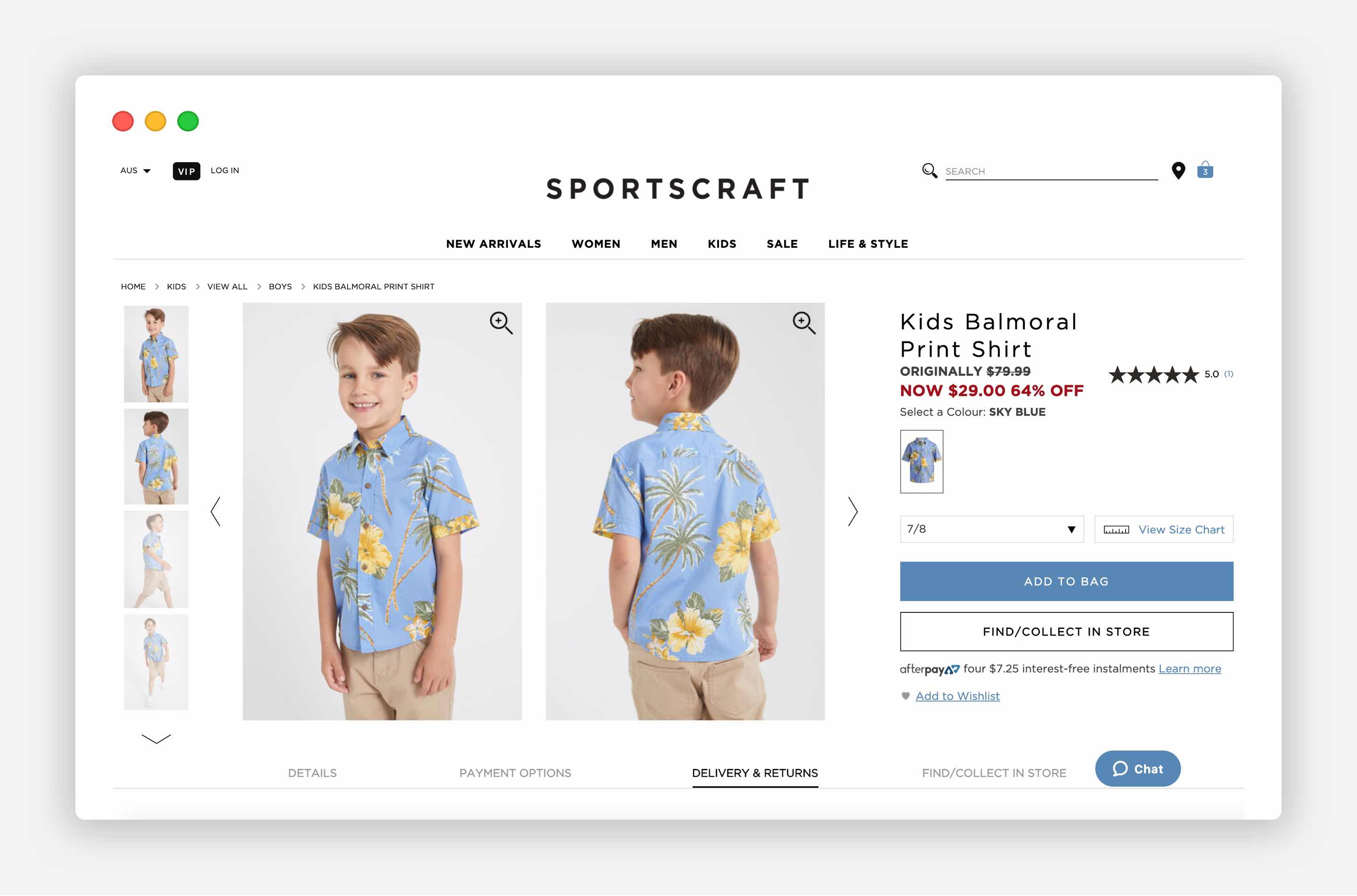
Make the Buy Now / Add to Cart button stand out. Don’t use fancy words to avoid confusing users.
You can give it a unique colour not used anywhere else on the page, or make it bigger and the text bolder. In other words, the Buy Now / Add to Cart button needs to stand out on the page.
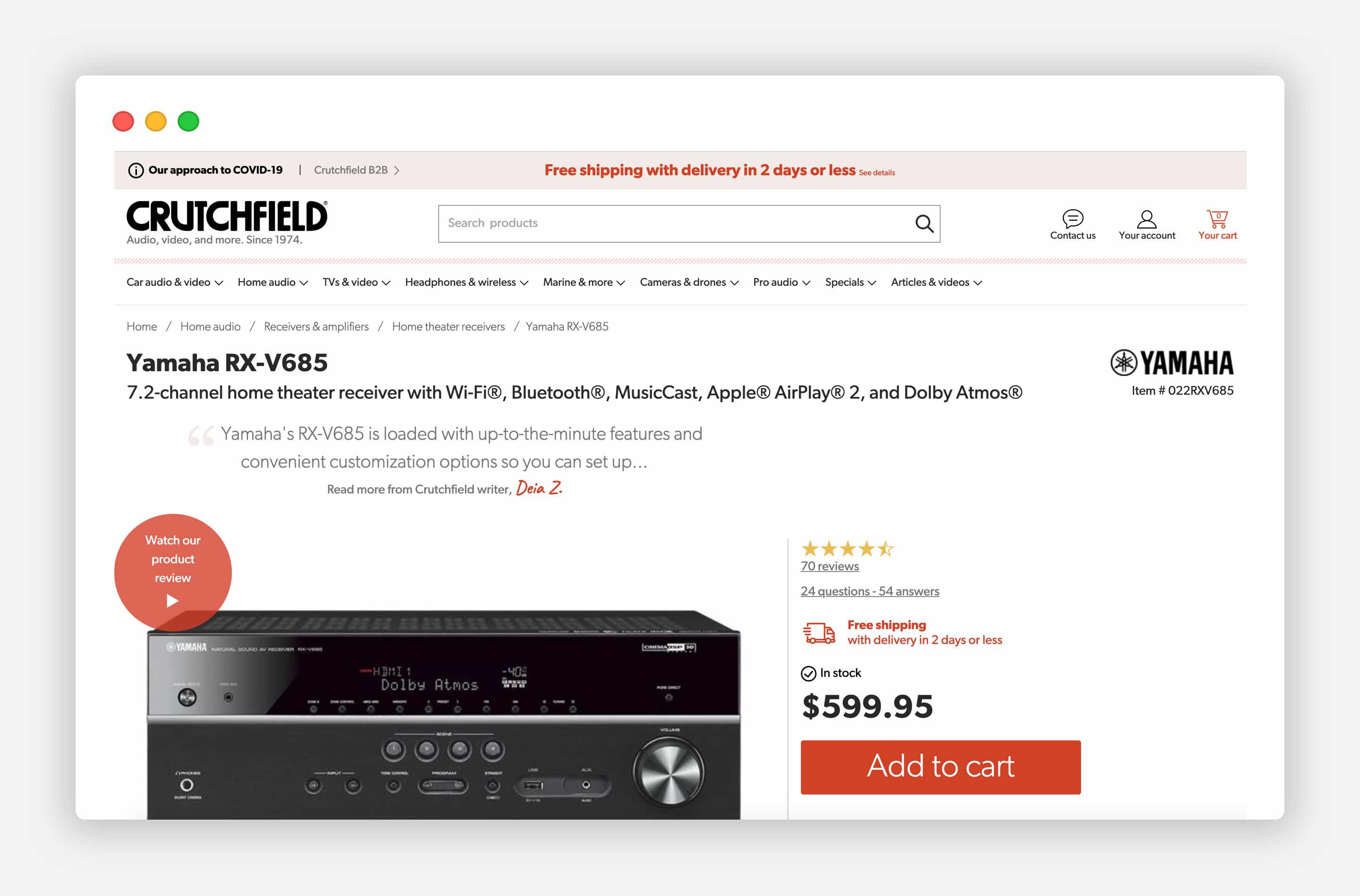
Are you selling one item per transaction? No worries. Use the Buy Now button. In this case, clicking on this button should redirect the user to the cart page with the item added so they can purchase the product.
Are you selling multiple items per transaction? Use the Add to Cart button to allow users to continue shopping. After the user hits the Add to Cart button, offer them a choice to go to the Cart or to continue shopping.
Another option for the call to action (CTA) buttons to keep in mind is related to Fitts’ Law.
According to Fitts's Law, targets a user has to hit (CTA buttons and the Buy button, in our case) have to be as big as possible, meaning that they need to be optimised so that there is a high chance of the user clicking the target.
The Product page would convert at a higher rate when the Quantity selector/dropdown and the Buy Now button are put close to each other, and the latter should not be smaller in size. This little tweak in design on the product page can play a significant role in driving more sales.
Fitts’ Law is also relevant for the mobile version of your e-commerce store where you need to keep the Buy Now button easy to reach for your users.
Price
How does your product differentiate from your competition? If you are selling the same product as many of your competitors, then make the price bigger size on the page.
Does your product have unique and exceptional qualities or related services (e.g. personalisation, environmentally-friendly, fast delivery, etc.)? Then sell the benefits that your products will bring to your customer using the emotional feel and by reducing the display emphasis on price.
Product Description
Make your product description speak to both the emotional and rational decision-making processes of the buyer. The product description needs to cover:
- what the product does
- how it makes your user feel, and
- how it will make life better for your user if they have it.
Don’t limit yourself on flattering and emotional language. Let your customers know how they will feel and how their life will become better if they make this purchase.
Don’t rely on the default description provided by your supplier or manufacturer. Instead, write the product features yourself. This is a win-win decision as it can also improve your on-page SEO, due to additional keywords that you can integrate into your product description.
Delivery Options
Do you know one of the biggest reasons for abandoned shopping carts in online stores?
It is the lack of information about delivery options and delivery-associated costs on the product page. By including these details on the product page, you appeal to the rational and emotional decision-making of your buyers.
Shipping is a real pain point for many buyers.
According to research, 58% of online shoppers say that shipping costs are likely to stop them from buying, with 34% of consumers refusing to buy when they need to wait a long time for delivery.
Offer an excellent shipping service to your customers, and they will choose your products over your competitors.
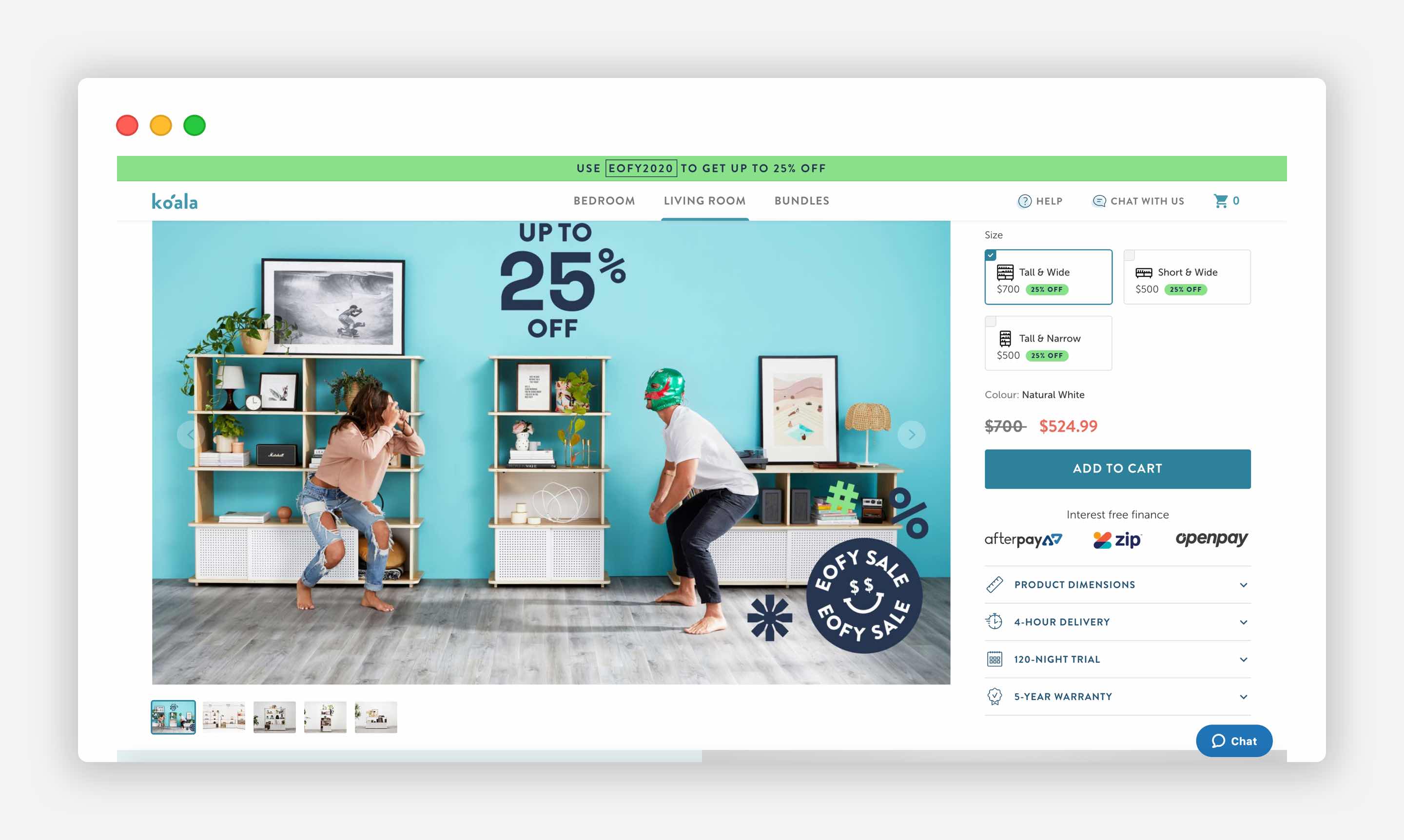
The ideal situation is that you offer a free delivery option, and fast delivery at a premium cost.
Also, if you sell low-cost and impulse purchases, make an emphasis on shipping speed. These customers want to get their purchases as quickly as possible as not to further doubt their spending decision.
Product Reviews
It’s not new that others’ opinions and social proof can significantly influence customers' decision-making.
Social proof is also called informational social influence, meaning that individuals assume that the actions of other people are the correct course to take.
The fact that one person tried a product, liked it and shared their positive experience, represents proof of the product’s high quality and is a good reason for another individual to try it too.
Customer Reviews are used in two different ways by users:
- Reviews are used to assess the quality of the product and your service and reassure themselves that what you say on the rest of the page is valid.
- Customer Reviews help find out about additional features of the product that might not be listed on the page.
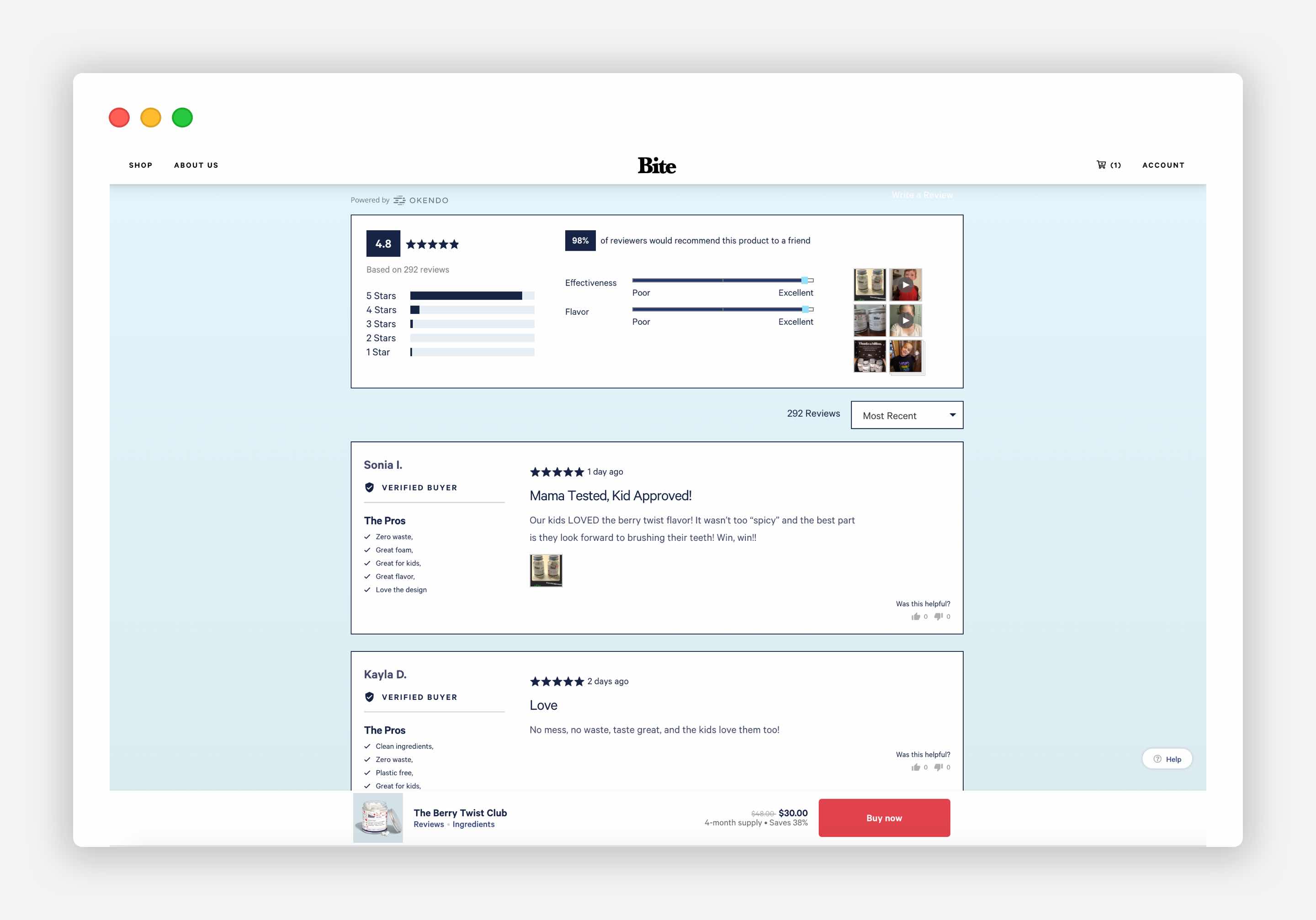
Thus, if you can provide a comprehensive set of reviews, they will add credibility to your product page and help sell your product. Don’t aim for overly positive reviews, though, as it is likely to lead to visitors questioning their accuracy and validity.
If you have concerns about negative comments, get more positive reviews!
There are several ways to show social proof on your product page to create trust between your website and a visitor:
- You can provide testimonials.
- You may include a picture of a happy customer who tried this product.
- Video testimonials work best and appear more trustworthy.
Detailed Product Specification
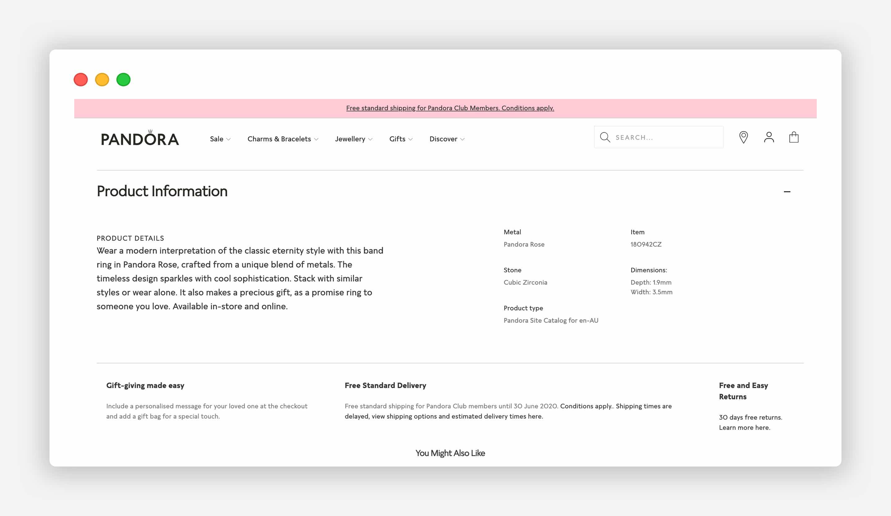
Some products like equipment and appliances are expected to have detailed product specifications, and many e-commerce stores put such detailed product description in the actual product description section. However, buyers rarely read all the information on websites and prefer to ask for a review from their community or watch third-party product reviews when they are considering purchasing a product.
The average person reads only 20% of a web page.
Moreover, many would agree that a massive list of features can look intimidating and, to be honest, tedious and even annoying for a user to read. And since we are working towards improving the user experience, we don't want to make the majority of your store visitors feel annoyed and walk away from your products.
For this reason, you can consider moving the extensive product specifications to a lower point on your product page.
Returns and Refunds
Many shoppers would agree that it’s great to know beforehand about return and refund policies. This is why they are essential elements which should be included on the product page.
58% of online shoppers say that a difficult return process is likely to stop them from buying.
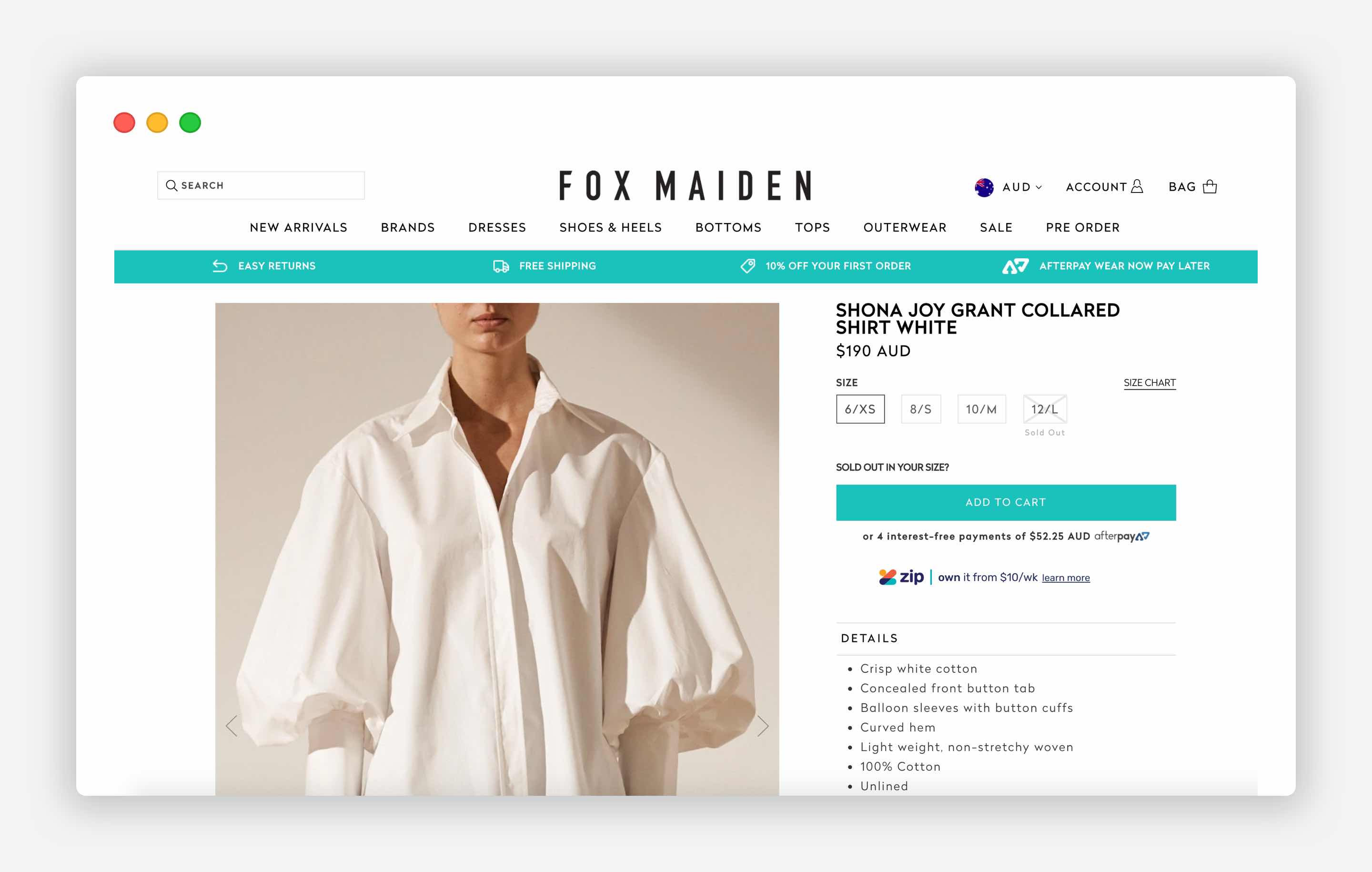
To conclude, when users are making a purchasing decision, they assess your product on both an emotional and a rational basis. The product page should both excite and reassure users that they are making the right choice. Otherwise, the product page will not perform as well as it should.
It is essential to check if your current product page addresses your customers' needs and find out the elements they pay attention to, fix any flaws your current page has, and start seeing improvements in conversion rates.
Want to set up a new Shopify store or optimise your existing store for conversion?
We can help you create a great online experience that your customers will love.
Click to learn more.

Considered vs Impulse Purchases
Knowing the difference between customers’ behaviour when they make considered and impulse purchases, and applying this knowledge in practice, is likely to increase conversion of your e-commerce store.
- How to increase conversion for considered purchases?
- How to increase conversion for impulse purchases?
How to increase conversion for considered purchases
A considered purchase is a complex buying decision with a high degree of financial and emotional risk and reward, which typically has a long purchase cycle and significant consequences.
It is important to consider customers’ behaviours when they make considered purchases. Customers usually:
- Shop by Quality and Service
- Think about a product and come back later
- Ask a friend
- Shop and read about the product around the web
- Multi-channel
- Read Product reviews
- Look at images
- Anticipate that the purchasing process should not be boring.
What should you do to increase the conversion of your e-commerce website for considered purchases:
- Make pictures bigger in size and higher in quality
- Allow saving a product for revisiting later
- Allow users to continue on another device by emailing their choices
- If a product was 'saved for later' or is in an abandoned cart, consider sending the user a reminder via email in 4+ hours, 24+ hours and 3+ days
- Having Product Reviews are essential
- Third-party product reviews are also important
- Show previously viewed items
- The purchase is about emotions and not features
- Make the purchasing process fun.
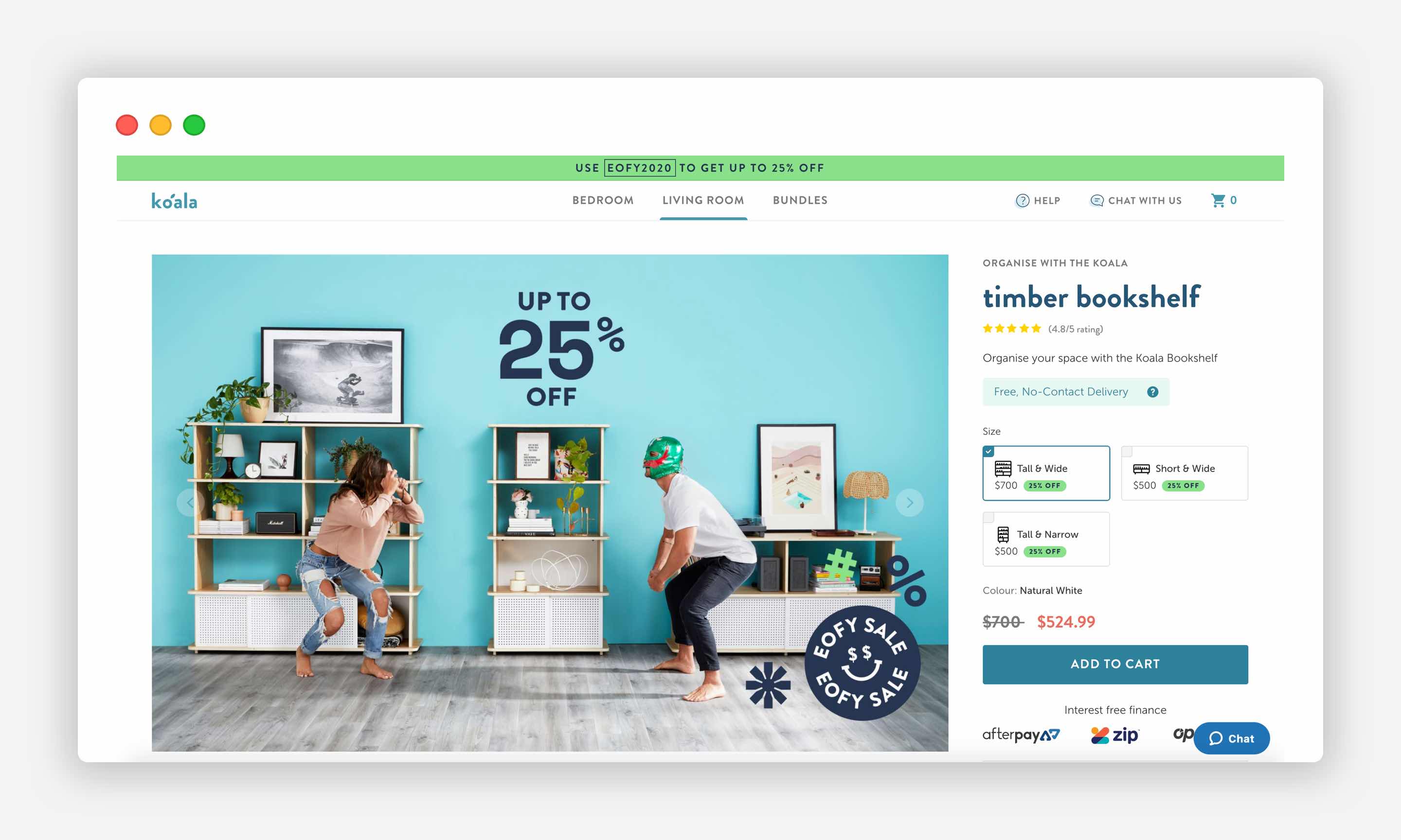
How to increase conversion for impulse purchases
An impulse purchase is a spur of the moment decision, where emotions and feelings play a decisive role in purchasing, triggered by seeing the product, or being exposed to a well-crafted promotional message.
It is essential to understand customers’ behaviours when they make impulse purchases:
- Price and Shipping speed are important
- Fear of missing out (FOMO) may drive their behaviour
- Like doing it on their own, not necessarily seeking advice from a friend
- Want to just get it over and done with
- Mono-channel
- Shop around
- Vendor reviews are important
- Impulse buyers love low-risk transactions.
What to do to increase the conversion of your e-commerce website for impulse purchases:
- Make pictures bigger and high-quality
- Low prices / Low-price guarantees
- Money-back guarantees / Warranties
- Reviews of the brand are important
- Clear shipping times and costs. Consider conditional free shipping as it is quite powerful and can motivate visitors to buy. Add fast shipping at a premium cost.
- Easy to reorder previously purchased items
- Avoid any pop-ups, delays, and distractions. Make the purchasing process as smooth and quick as possible.
- Improved usability for mobile devices is critical.
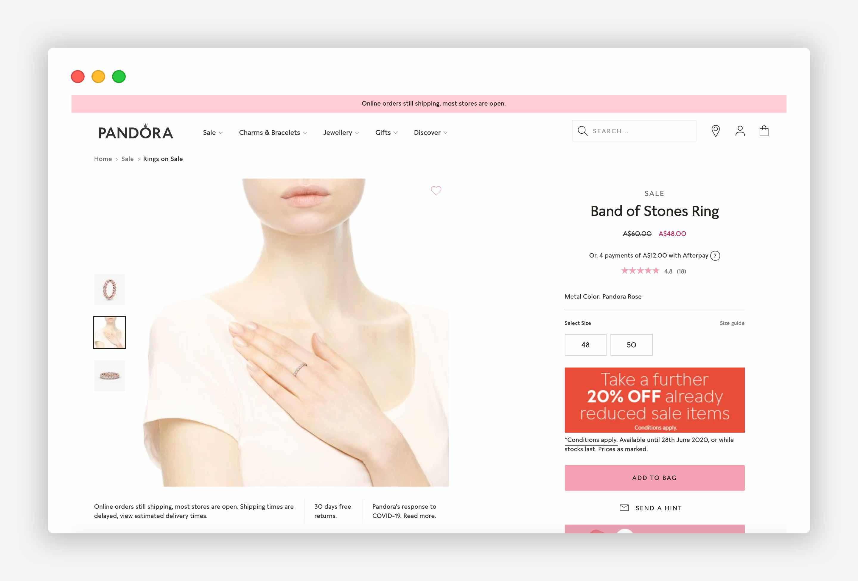
In conclusion, to boost your sales, it is essential to use psychology and research to understand your customers’ behaviour and needs because by leveraging these concepts, you can enhance user experience on your site and the bottom line for your business. Your e-commerce store visitors will not notice any difference, but eventually, you will be happy you made an effort of adding these concepts to your online store to improve its success.
Need an exceptional user experience for your online store?
Our niche skills in e-commerce help us deliver great results that create an exceptional online shopping experience for your customers.
Click here to learn more.
Resources and appreciations
- Adobe Consumer Electronics Report 2020
- Amar Hussain: 5 Psychological Concepts Web Designers Should Use to Maximize Conversions
- Conversion Optimisation: Close the Conversion Gap. Cater to the Impulse Purchase
- Danny Goodwin: Top Google Result Gets 36.4% of Clicks, Study
- Dave Lloyd: SEO for Success in Video Marketing
- IRP Commerce: ECommerce Benchmarks and eCommerce Market Data
- FastCompany: Why We’re More Likely To Remember Content With Images And Video (Infographic)
- Gabe Donnini: Google Results Position: How Much Is First Place Really Worth?
- Joe Leech: How to do a UX Review: The Definitive Guide
- Joe Leech: The Top UX Elements to Optimize Your Clients’ Product Page Design
- Littledata: 6 essential benchmarks for Shopify stores
- Sheena Sethi Iyengar, Mark Lepper: When Choice is Demotivating: Can One Desire Too Much of a Good Thing? January 2001 Journal of Personality and Social Psychology
- The jar icon made by Darius Dan from www.flaticon.com
- Think with Google: The Rise of Comparison Shopping on Mobile: Which-One's-Best Moments
- Tracey Wallace: Modern Consumer Behavior in the New Omni-Channel World + 31 Expert Tips to Dominate It Now
- Ultralinx: Impact of images on social media | Infographic
Frequently Asked Questions
How is an e-commerce conversion rate calculated?
The e-commerce conversion rate formula is: E-commerce conversion rate, % = Total Number of Purchases / Total number of sessions.
What is the e-commerce conversion rate?
E-commerce conversion rate measures how well your website traffic converts into customers. The formula is the number of purchases divided by the total number of sessions. This is because most visitors take more than one session to make a purchasing decision.
What is an average ecommerce conversion rate by industry in 2020?
According to IRP Commerce, e-commerce conversion rates by the industry as of November 2020 [27 December 2020 update] constituted: Health and Wellbeing 3.23% Fashion Clothing & Accessories 2.42% Food & Drink 2.37% Cars and Motorcycling 1.51% Electrical & Commercial Equipment 2.26% Sports and Recreation 1.27% Pet Care 3.37% Baby & Child 1.14% Arts and Crafts 4.04% Kitchen & Home Appliances 3.03%.
How to increase an e-commerce conversion rate?
Knowing the difference between customers’ behaviour when they make considered and impulse purchases, and applying this knowledge in practice, is likely to increase conversion of your e-commerce store. Also, you might need to optimise the user experience on your product page.
More To Explore

Next.js Framework For Full-stack and Frontend Development
Laravel Development Services & Consulting in Melbourne
